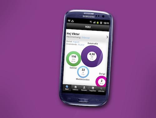
Mobile operator 3 and service design consultancy Fjord have announced the release of “My 3,” an app for iPhone and Android that lets customers understand their latest voice, messaging, and data usage. Using data visualisations, the app helps 3 customers manage their subscriptions and control their costs. The app will initially be available in Sweden.
The My 3 app turns subscription models with different add-ons into data visualisations, giving 3 customers a way to see trends in their usage patterns – including who they message most, how much data they use, and what time of day they are most active on their phones. Showing information from the last six months of usage, My 3 also makes it possible for users to track roaming costs and see how much of their voice and data tariff they have used at any given time, providing increased insight into and control over costs to avoid “bill shock” at the end of the month.
For 3, the app also means a direct communication channel to the user aimed at saving them the need to call for customer support. In working with 3 to design the service, Fjord took a user-centered approach that puts transparency and customer service at the forefront of the service.
“My 3 represents a huge step forward in using design to take the frustration and confusion out of the mobile phone bill. The experience is not only fun to use, but also truly useful for customers who want to get the most value out of their smartphones,” said Daniel Freeman, service design director at Fjord.
“With My 3, we wanted to do something completely new to help our customers really understand their mobile phone usage. By partnering with Fjord, we have created a beautiful, innovative way to give our customers access to their data and show our commitment to transparency,” said Johan Gertell, vice president of digital services at 3 Sweden.
Features in the app
- Self Service – Total costs at a glance leading to a deep dive breakdown of live usage and allowances in all categories
- Visual representations of usage: Innovative ‘vinyls’ and ‘doughnuts’ appear on the mobile screen to show usage, limits, and costs through colourful, easy-to-understand graphics
- Invoices – Overview of current invoice and historical payments
- Customer care – information on customer service, opening hours, direct connection and indication of busy hours
- Top lists – Dynamic phonebook with favourite messaging and calling buddies with highlights of other 3 users
- Trends – Daily usage trends as well as an overview of the past 6 months of usage history and a comparison to typical 3 users


